
CSS3复杂动画效果
1. html代码
<!DOCTYPE html>
<html lang="en">
  <head>
    <meta charset="UTF-8" />
    <meta name="viewport" content="width=device-width, initial-scale=1.0" />
    <title>电子简历-项目经验</title>
    <link rel="stylesheet" href="css/style-outer.css" />
    <link rel="stylesheet" href="css/font-style.css" />
  </head>
  <body>
    <!-- container 溢出隐藏 高宽:300px -->
    <div class="container">
      <!-- wrap 背景图片 高宽:280px -->
      <div class="wrap">
        <!-- bg-wrap 背景透明 -->
        <div class="bg-wrap">
          <h3>雨果学院</h3>
          <p>技术-HTML5-CSS3</p>
          <span class="icon-search"></span>
        </div>
      </div>
    </div>
  </body>
</html>
2. css代码
*{padding: 0;margin: 0; font-size: 14px; color: rgb(214, 65, 65);}
a{text-decoration: none;}

/* 整个元素水平垂直居中 */
body{
    height: 100vh;
    display: flex;
    justify-content: center;
    align-items: center;
}

/* 设置图片元素,水平垂直居中,溢出隐藏 */
.container{
    width: 300px;
    height: 300px;
    display: flex;
    justify-content: center;
    align-items: center;
    overflow: hidden;
}

/* 设置背景图片 */
.container .wrap{
    width: 280px;
    height: 280px;
    background: url('../image//01.jpg') no-repeat;
    transition: all .3s ease-out;
    background-size: cover;
}

/* 鼠标移入背景图放大效果 */
.container .wrap:hover{
    transform: scale(1.3);
}

/* 背景全透明,内部元素水平垂直居中 */
.container .wrap .bg-wrap{
    width: 100%;
    height: 100%;
    background-color: rgba(0, 0, 0, 0);
    transition: all 0.3s ease-out;
    display: flex;
    justify-content: center;
    align-items: center;
    position: relative;
}
/* 背景透明显示 */
.container .wrap:hover .bg-wrap{
    background-color: rgba(0, 0, 0, .4);
}

/* 元素重叠效果 */
.container .wrap .bg-wrap h3,p,span{
    position: absolute;
    transition: all .3s ease-out;
    color: white;
    opacity: 0;
}

/* 上面元素向上移动,放大效果 */
.container .wrap:hover .bg-wrap h3{
    opacity: 1;
    transform: translateY(-40px) scale(1.3);
    font-size: 14px;
}

/* 中间元素放大效果 */
.container .wrap:hover .bg-wrap p{
    transform: translateY(0) scale(1.3);
    font-size: 12px;
    opacity: 1;
}

/* 下面元素向下移动,放大效果 */
.container .wrap:hover .bg-wrap span{
    transform: translateY(40px) scale(1.3);
    opacity: 1;
}
转载请注明来源:CSS3复杂动画效果
周sir
这家伙很懒,什么都没写!
你可能也喜欢
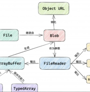
前端文件流、切片下载和上传:优化文件传输效率与用户体验
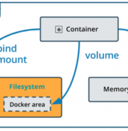
Docker-Compose发布与部署
制作自己的镜像
Docker 快速安装软件


![AOP 那点事儿[续]](http://www.yuguoxy.com/geekhome/wp-content/themes/Enews/timthumb.php?src=http://www.yuguoxy.com/geekhome/wp-content/uploads/2017/11/微信截图_20200508200107.png&h=60&w=67&zc=1)


